
U.S. Debt Interest Payments Hit $723 Billion, Now the Second Largest Federal Expense
The U.S. Treasury's latest monthly statement shows net interest on the national debt has surpassed Medicare, Health, and National Defense in FY 2026.

Sanjeev Pati, CFA
Founder, Scatterplot
Key Takeaways
- Net interest payments are $723 billion YTD in FY 2026, second only to Social Security among all federal outlays. At the current pace, the full-year bill is on track to exceed $1 trillion.
- A year ago, interest ranked fourth behind Social Security, Medicare, and Health. It passed all three in a single fiscal year.
- As of Q2 FY2026, approximately 33 percent of U.S. publicly held marketable debt matures within the next 12 months, roughly $10 trillion that needs to be refinanced at today's rates.
- Treasury yields are up across the entire curve in 2026. The Fed Funds rate remains at 3.8%, and with rate cuts no longer appearing probable, pressure from inflation, corporate bond supply, and fiscal risk at the long end is unlikely to ease soon.
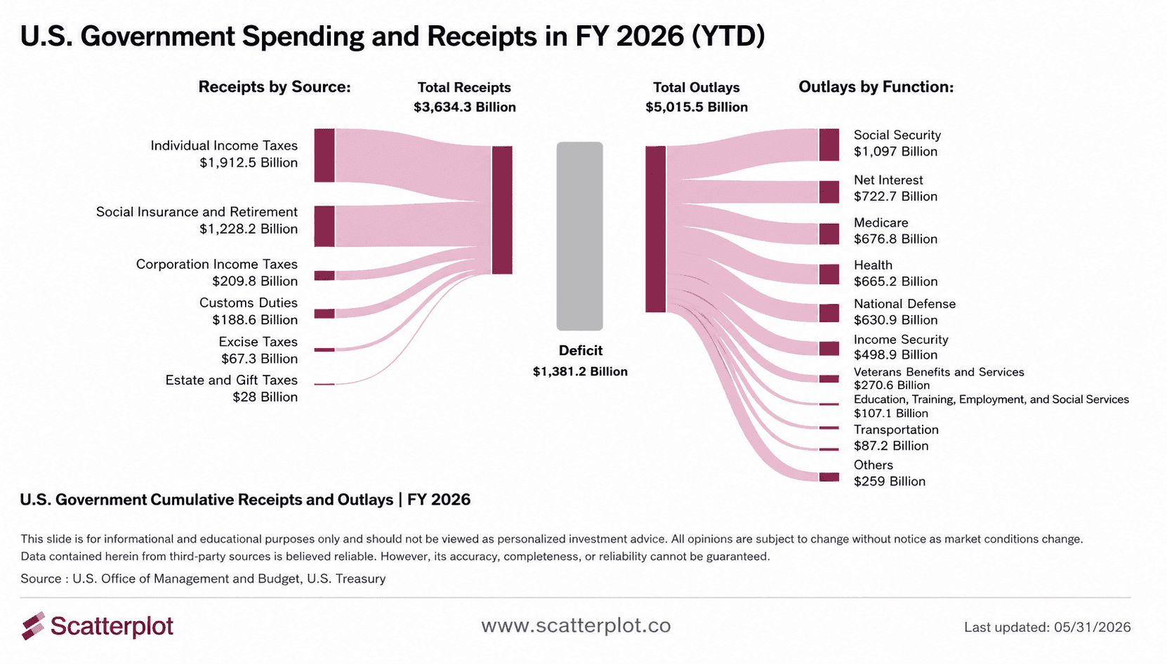
Where the Government's Money Goes
Every month, the U.S. Treasury releases a statement of federal receipts and outlays. The most recent one, covering FY 2026 through May, tells a clear story.
The federal government has collected $3.6 trillion in revenue this fiscal year and spent $5.0 trillion. The deficit stands at $1.4 trillion. And for the first time, net interest payments on the national debt rank second in how that $5 trillion is spent.
The chart below shows the full breakdown of federal receipts by source and outlays by function for FY 2026 year-to-date, including where net interest sits relative to every other spending category.
This chart updates daily in the Scatterplot portal.
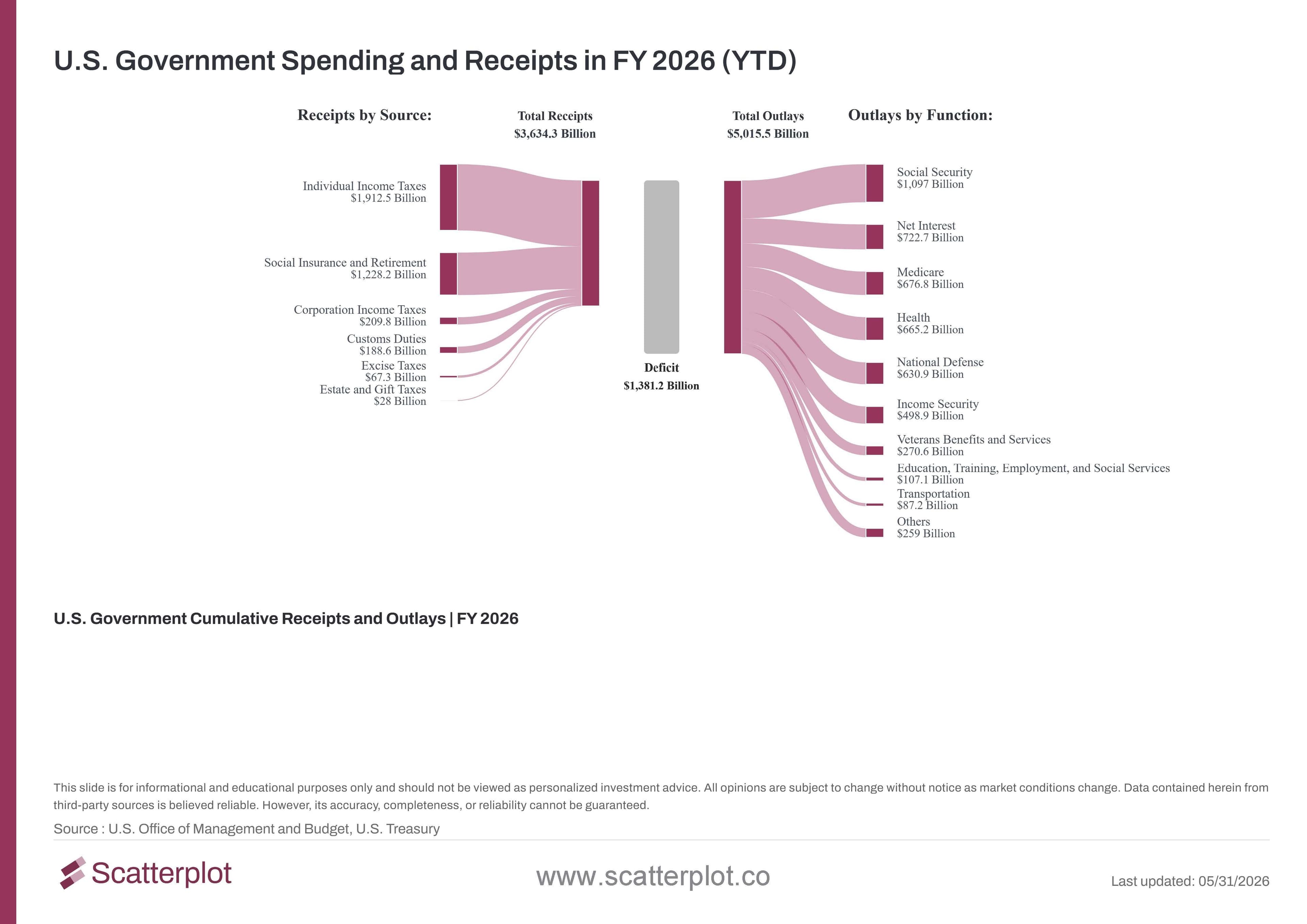
The shift in rankings becomes clear when you compare FY 2025 to where things stand today.
Source : U.S. Office of Management and Budget, U.S. Treasury
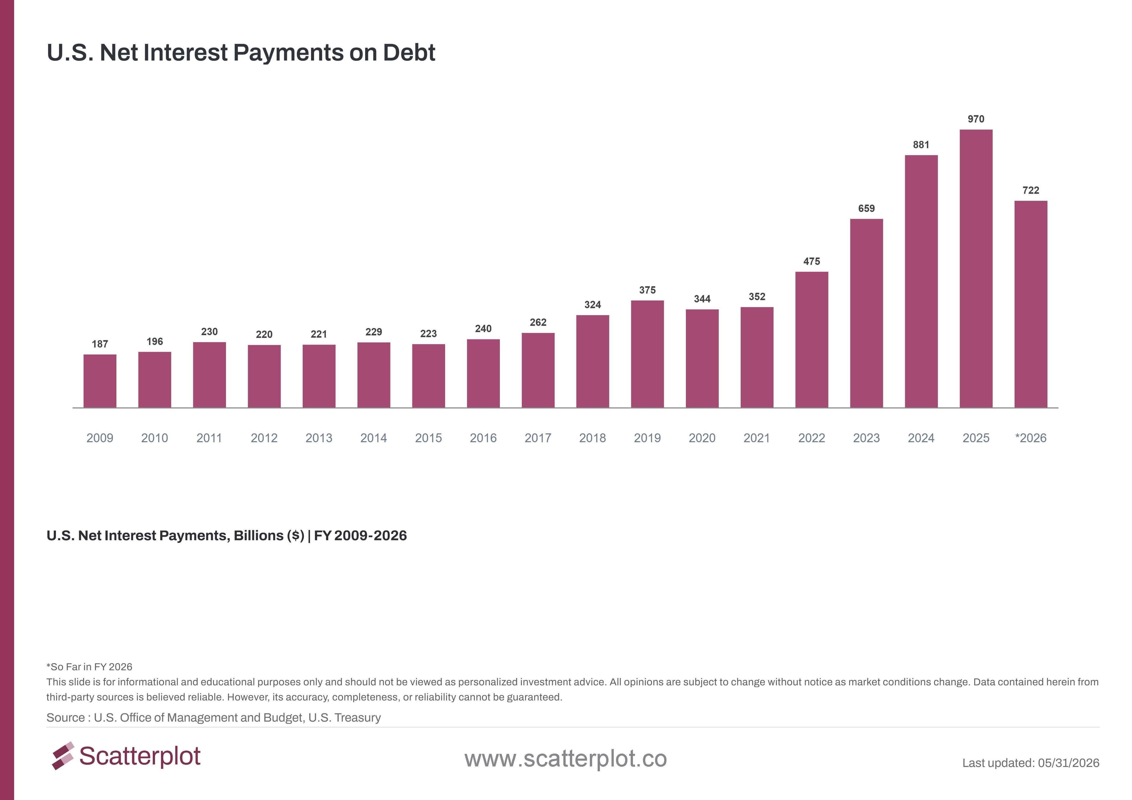
How Interest Payments Got Here
Ten years ago, the annual interest bill was around $230 billion.
Two things happened at the same time. Years of deficit spending grew the total debt outstanding. And when the Federal Reserve raised rates starting in 2022, the government had to refinance maturing low-rate debt at significantly higher rates. The two forces compounded each other. The chart below shows the growth in U.S. net interest payments on debt from FY 2009 through FY 2026.
This chart updates daily in the Scatterplot portal.
FY 2026 is on pace to cross $1 trillion for the first time.
As existing Treasury bonds mature, the government must issue new ones at current rates. As of Q2 FY2026, approximately 33 percent of U.S. publicly held marketable debt is set to mature within the next 12 months. At current debt levels, that represents roughly $10 trillion in debt that needs to be refinanced at today's rates. Even if yields edge lower, a sustained 4% plus rate environment translates directly into a structurally higher interest bill for years ahead.
Why Borrowing Costs Are Not Coming Down
The chart below shows Treasury yields across every maturity as of June 11, 2026, compared to where they started the year :
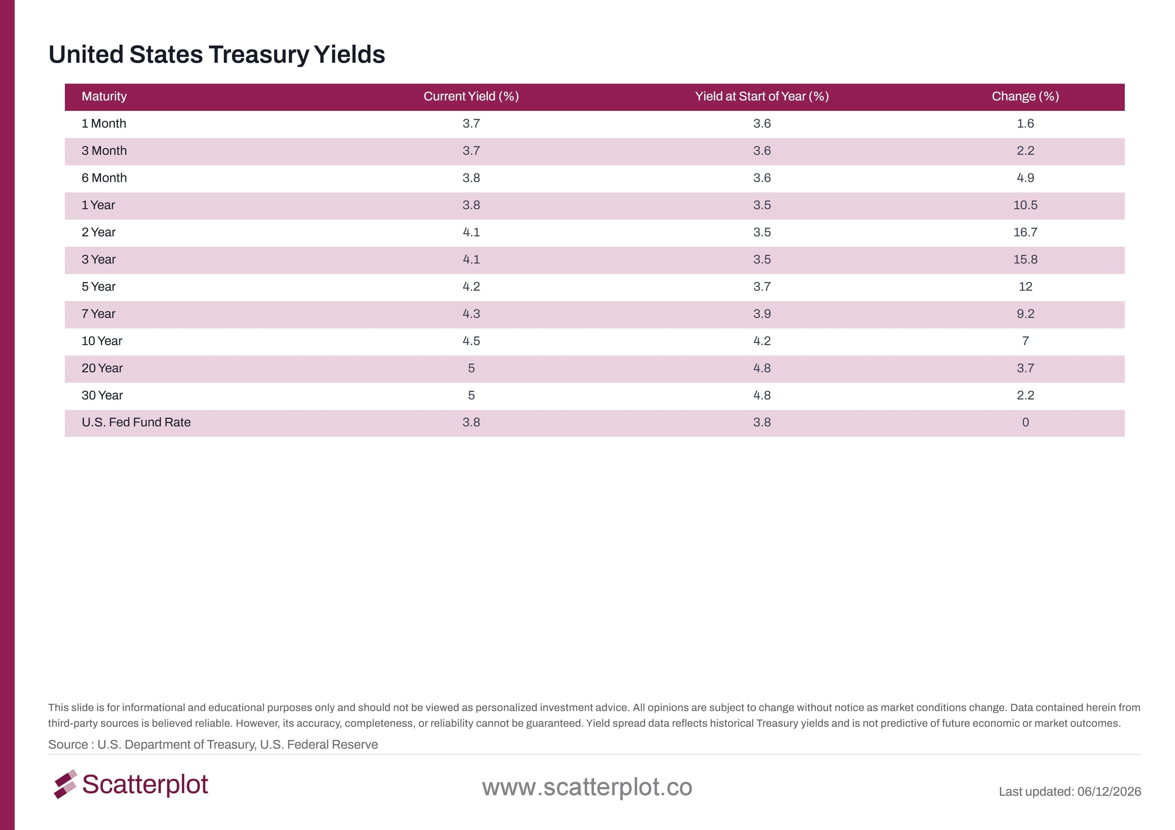
This chart updates daily in the Scatterplot portal.
Yields are up across every maturity. The 1-year is up 12.2% since January. The 2-year is up 18.7%. The 10-year is up 8.6%. The 30-year is up 3.4% and sits at 5%. Three forces are driving this:
- Rate cut expectations reversed. Earlier in the year, markets had priced in several Fed rate cuts. Persistent inflation and geopolitical developments, including the conflict in Iran, shifted those expectations materially. The Fed Funds rate remains at 3.8% , exactly where it started the year , and cuts that seemed likely no longer appear probable
- Belly pressure from corporate issuance. Large corporations, particularly in the technology sector, are issuing significant volumes of corporate bonds. That additional supply is pushing yields higher in the belly of the curve (the 3- to 7-year maturity range)
- Long end pressure from fiscal risk. The 20- and 30-year yields both sit at 5%. In part reflecting fiscal concerns, some market participants interpret the rise in long-term yields as reflecting uncertainty about the government's long-term fiscal trajectory.
Where This Is Heading
The deficit is still growing. Yields show no clear path lower. And the debt stock that needs to be refinanced keeps getting larger.
If those conditions persist, debt service could surpass Social Security and become the single largest line item in the federal budget within the next fiscal year. It is not a forecast , but the current trajectory makes it a scenario worth watching.
Frequently Asked Questions
What are U.S. net interest payments on debt?
Net interest payments are the amount the federal government pays to service its outstanding debt, minus interest it receives on loans and other assets it holds. It is reported monthly by the U.S. Treasury as part of the Monthly Treasury Statement.
When did interest payments become the second largest federal expense?
Based on FY 2026 year-to-date data through May 31, 2026, net interest payments have moved to second place among all federal outlays , behind Social Security and ahead of Medicare. In FY 2025, interest ranked fourth. The shift happened within a single fiscal year.
Why are U.S. Treasury yields rising in 2026?
Yields are rising for different reasons at different points on the curve. Short-term yields are elevated because inflation has kept the Fed from cutting rates. Mid-curve yields have risen sharply in 2026, a move some market participants attribute in part to large-scale corporate bond issuance. Long-term yields are rising in part because bond markets are pricing in fiscal risk , uncertainty about the government's ability to manage its debt load over the long term.
Is the U.S. government's interest payment burden unusual historically?
Net interest payments of $970 billion in FY 2025 represent a near-fourfold increase from 2020 levels, when payments were $344 billion. The combination of a larger debt stock and significantly higher interest rates is what has made the recent increase so sharp.
Where can I find these charts in the Scatterplot portal?
Search "US Debt Interest Payments" in the Scatterplot portal to find not only these charts but a much broader library of related data including federal receipts and outlays, debt maturity schedules, Treasury yield curves, historical deficit trends, and more. All charts are updated on a daily or monthly basis depending on when the underlying source data is released.
Disclosure
This post is for informational and educational purposes only and should not be viewed as personalized investment advice. All opinions are subject to change without notice as market conditions change. Data contained herein from third-party sources is believed reliable. However, its accuracy, completeness, or reliability cannot be guaranteed. References to specific securities or asset classes are provided to illustrate market concepts and are not a recommendation to buy, sell, or hold any security. Past performance is no guarantee of future results. Data sources: U.S. Office of Management and Budget, U.S. Treasury, U.S. Department of the Treasury, U.S. Federal Reserve, Apollo Global Management. Last updated June 11, 2026.


Enjoyed this? Get more in your inbox.
Weekly insights for advisors
— charts, research, and practical tools. No fluff.
Investment Foundations
Understanding Recency Bias: What U.S. Equity Returns Reveal About Investor Expectations
Exploring Recency Bias in Investors Using Recent and Long-Term U.S. Equity Data.
Read moreSanjeev Pati, CFA
July 6, 2026 · 4 min read
Investment Foundations
Why Market Timing Is So Hard: 70% of the best days in the market land near the worst ones
Market timing is hard. Since 1993, 70% of the S&P 500's ten best trading days occurred within 20 days of one of its ten worst trading days, making it difficult to capture one without being exposed to the other.
Read moreSanjeev Pati, CFA
June 26, 2026 · 5 min read