

US Debt Nears $40 Trillion
A look at the latest Treasury data: US debt nears $40 trillion, customs duties turn negative on tariff refunds, and the FY2026 deficit widens.

Sanjeev Pati, CFA
Founder, Scatterplot
Introduction
The Treasury released its Monthly Treasury Statement for July. Total government debt (gross federal debt) is closing in on $40 trillion. Customs duties came in negative for the third month in a row, a byproduct of the government refunding tariffs the Supreme Court struck down earlier this year. And the fiscal year to date deficit has already topped all of last year's shortfall, with two months still left to go.
Key Takeaways
- Total US government debt (gross federal debt) stands at roughly $39.9 trillion.
- Customs duties came in net negative $8.5 billion in July (that's billion, not million), after the government paid out $33.4 billion in tariff refunds tied to a Supreme Court ruling. It's the third straight month customs revenue has gone negative.
- Through the first ten months of fiscal year 2026, the government has collected $4.5 trillion and spent $6.3 trillion, leaving a $1.8 trillion deficit that already exceeds all of fiscal year 2025's deficit.
- Net interest outlays have reached $931 billion so far this fiscal year, making it the third largest federal outlay behind Social Security and Medicare.
How Close Is the US to $40 Trillion in Debt?
Total US government debt currently stands at $39.9 trillion. Debt growth has been the backdrop of federal finances for years, and the recent pace puts a round-number milestone within sight. Total public debt outstanding (this counts both what the government owes outside investors and what it owes its own trust funds, like Social Security) is now close enough to $40 trillion that the milestone could show up in the data within weeks, based on the recent daily growth rate. Debt held by the public alone, which excludes what the government owes its own trust funds, runs closer to ~100% of GDP.
The chart below shows total US government debt since 1942 :
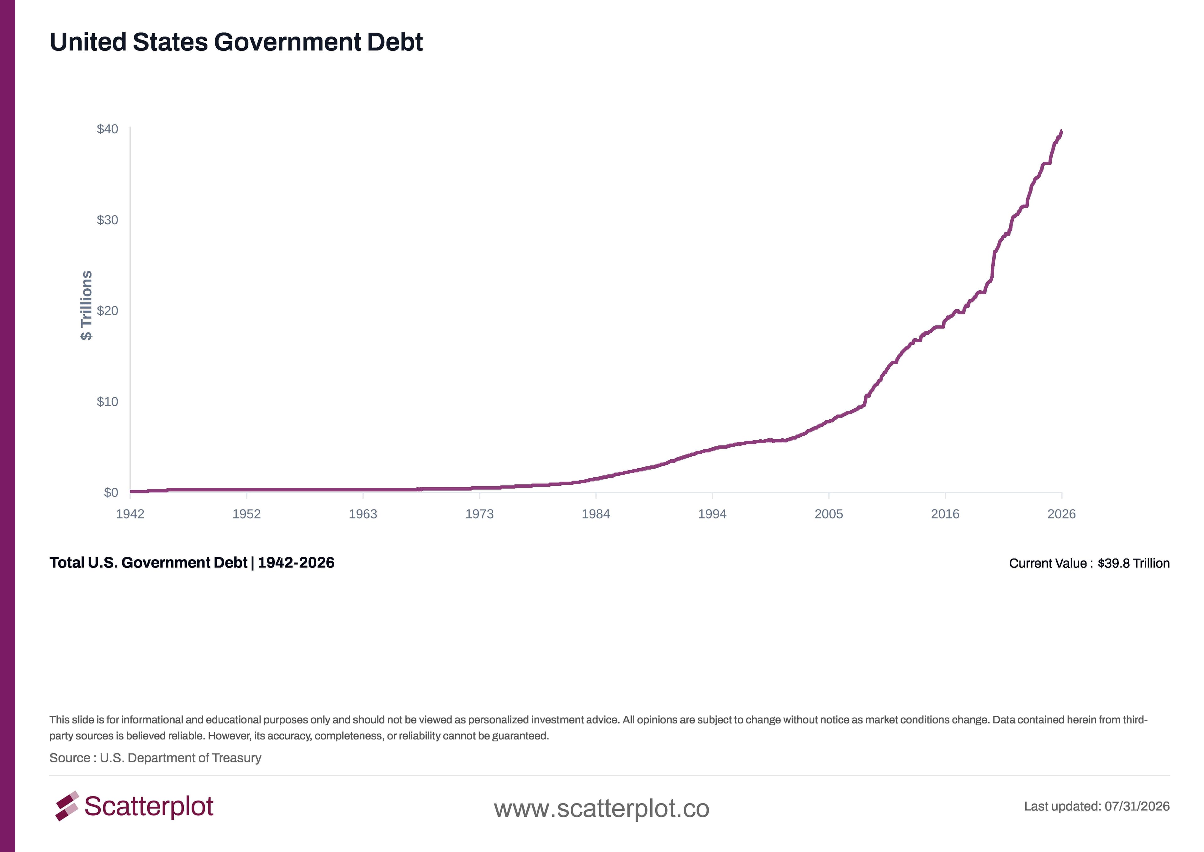
This chart updates daily in the Scatterplot portal.
Why Did Customs Duties Go Negative This Month?
This is the more unusual data point in the release. Customs duties, normally a small but steady revenue line, have now been net negative for three consecutive months. That's because the Supreme Court ruled earlier this year that a set of tariffs imposed under emergency powers were not valid, and the government has been refunding the duties collected under them ever since. In July, $33.4 billion in tariff refunds went out against roughly $24.8 billion in gross customs collections, leaving net customs receipts at −$8.55 billion for the month. May and June were also negative, at approximately −$0.04 billion and −$25.6 billion, respectively.
Even with three straight negative months, customs duties are still running at $154.5 billion for the fiscal year to date.
The chart below shows annual customs duties collected since 2009 for each fiscal year :
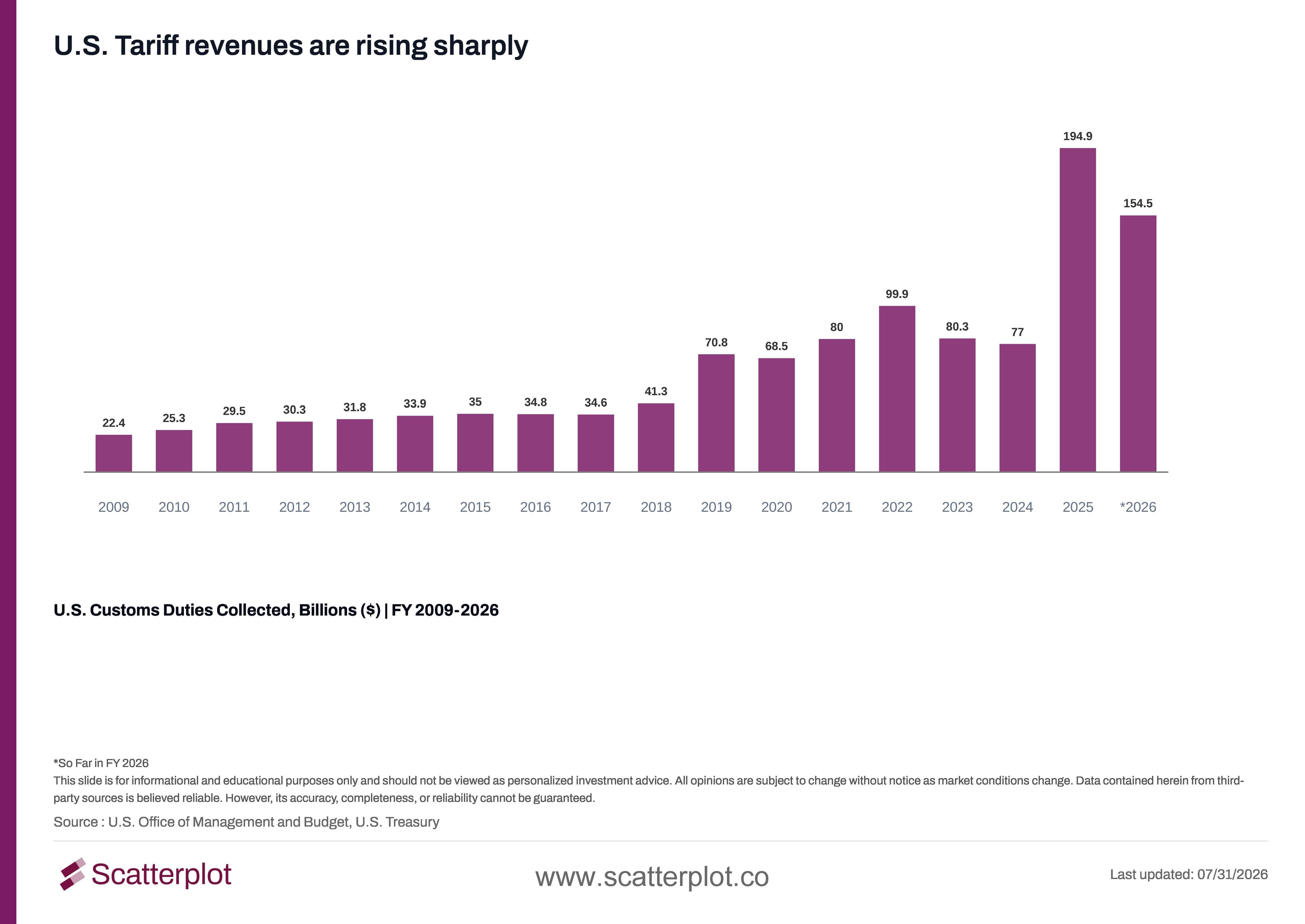
This chart updates daily in the Scatterplot portal.
How Do Revenue, Spending, and the Deficit Compare in FY2026?
Zooming out to the full fiscal year picture, the gap between what the government collects and what it spends has been widening for a while, and FY2026 is no exception.
The chart below shows the annual federal deficit since 2009.
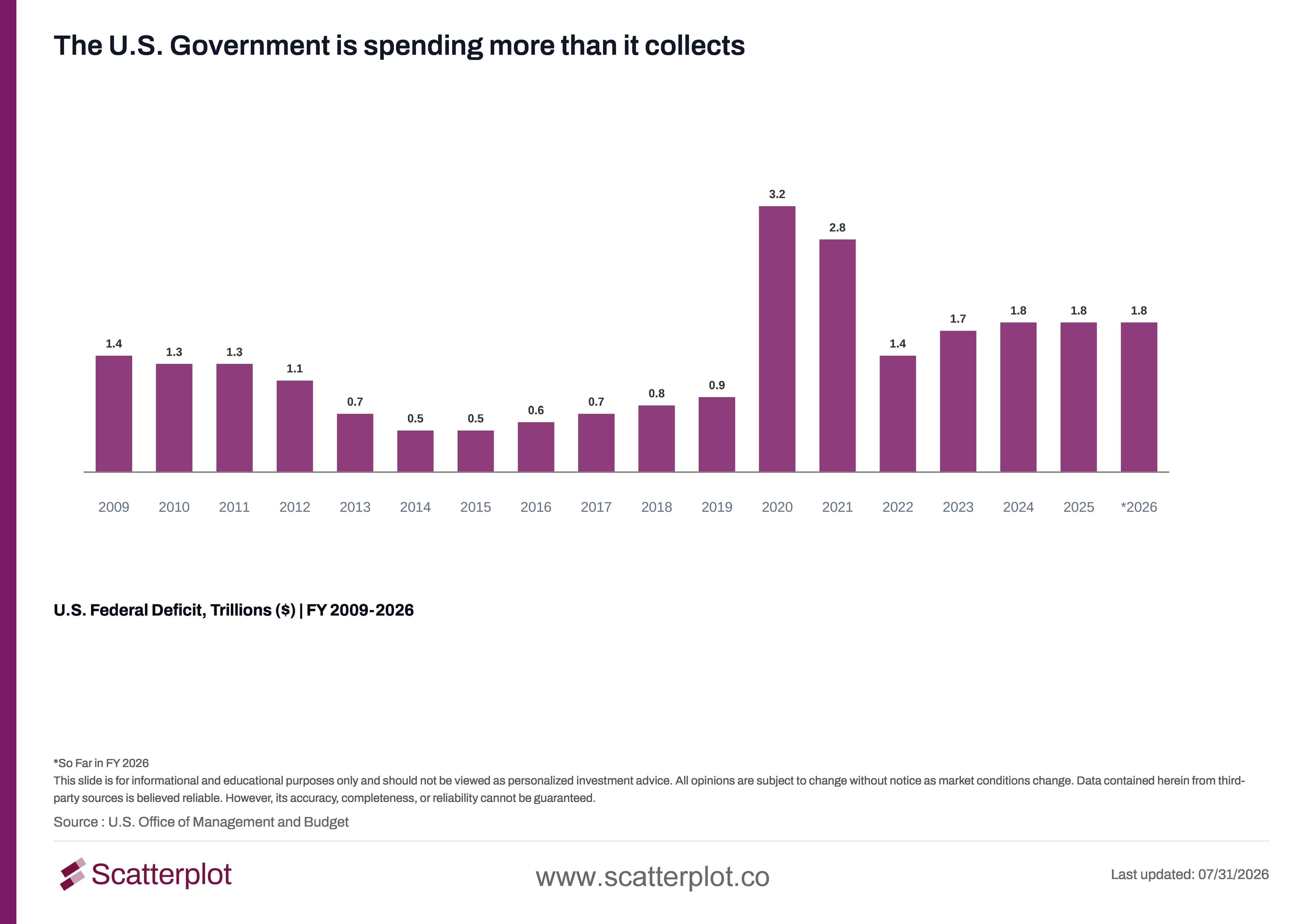
This chart updates daily in the Scatterplot portal.
The chart below shows total government revenue over the same period.
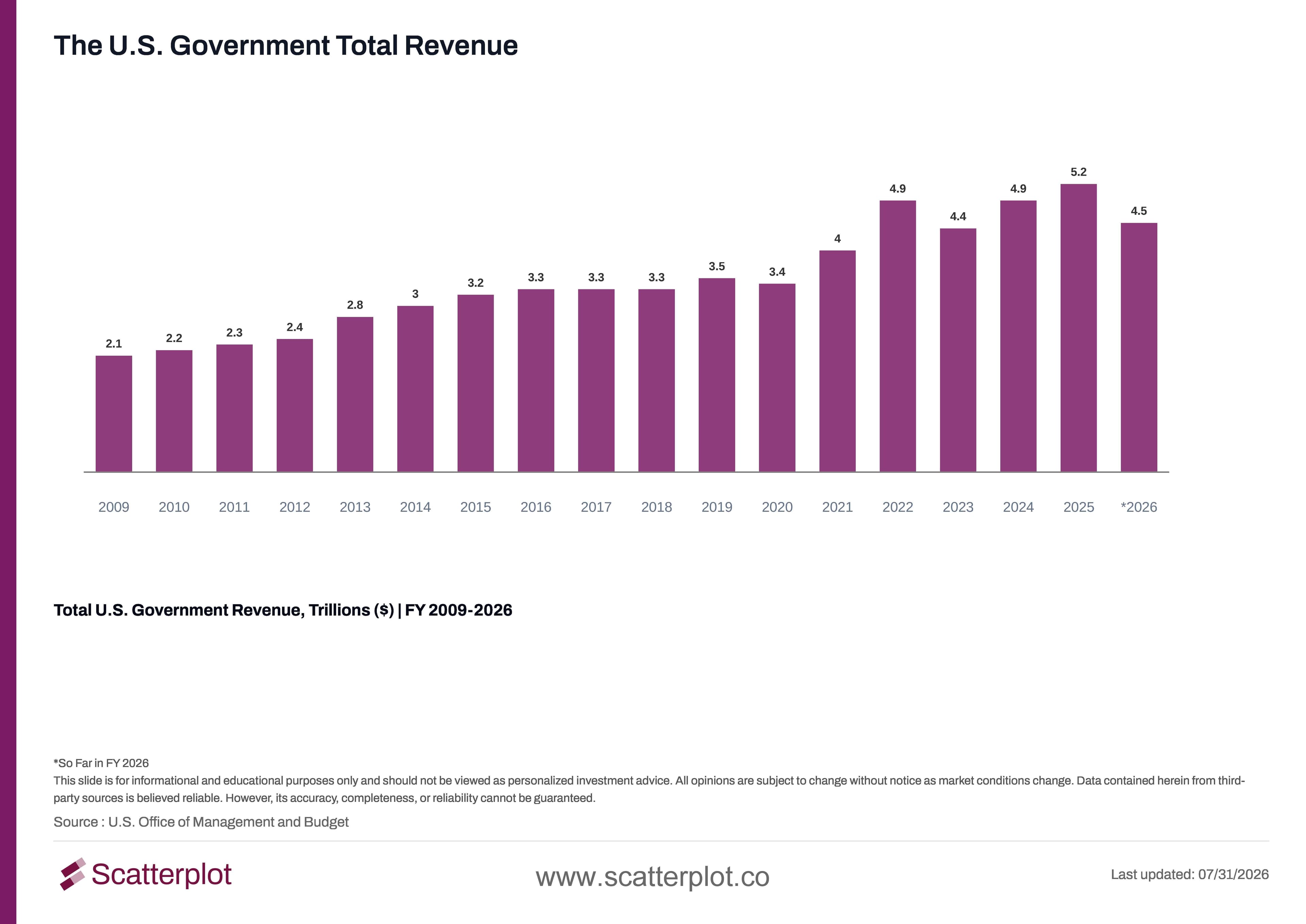
This chart updates daily in the Scatterplot portal.
The chart below shows total government spending over the same period.
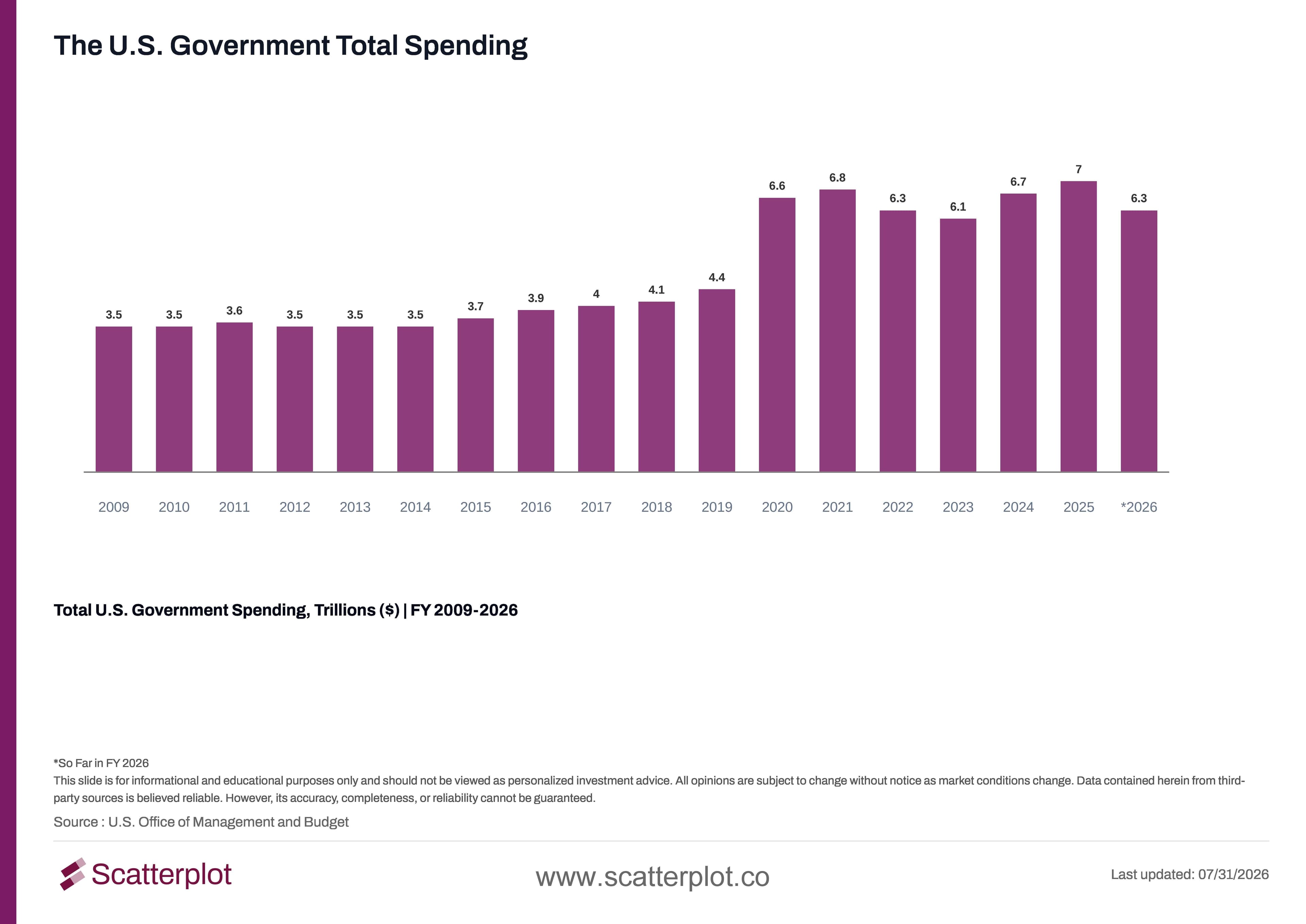
This chart updates daily in the Scatterplot portal.
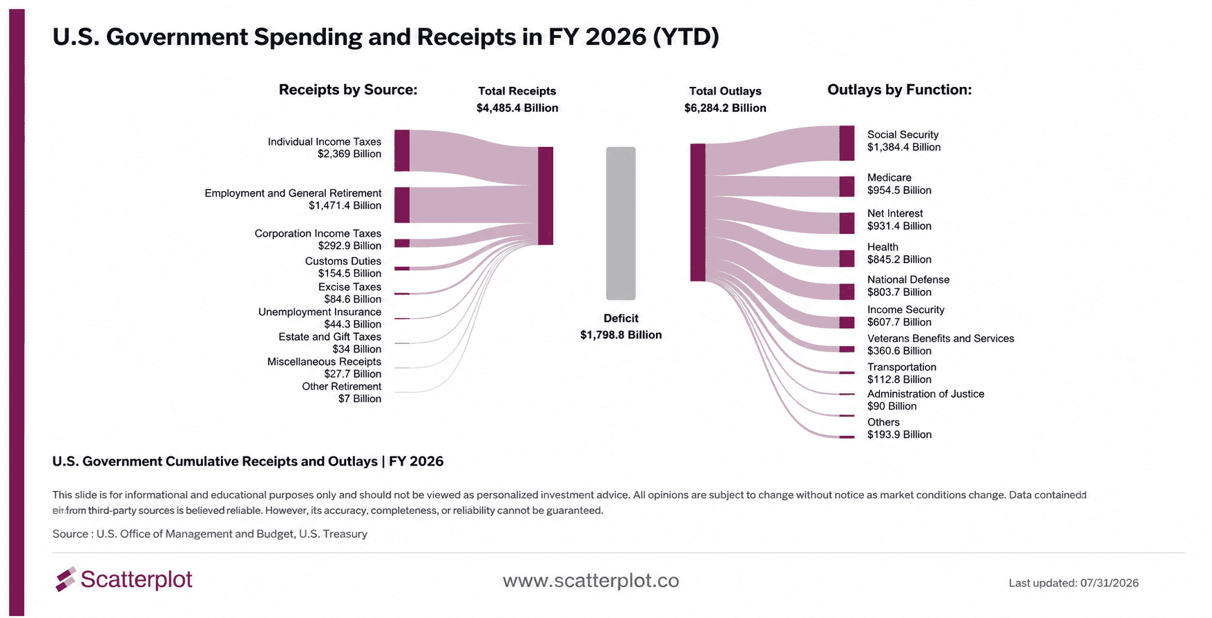
Through the first ten months of the fiscal year, the government has collected $4.5 trillion and spent $6.3 trillion, leaving a $1.8 trillion deficit, already ahead of all of fiscal year 2025's deficit. Net interest outlays, at $931 billion so far this year, have now grown into the third largest outlay category, behind only Social Security and Medicare and ahead of national defense.
The chart below shows how net interest payments have grown since 2009.
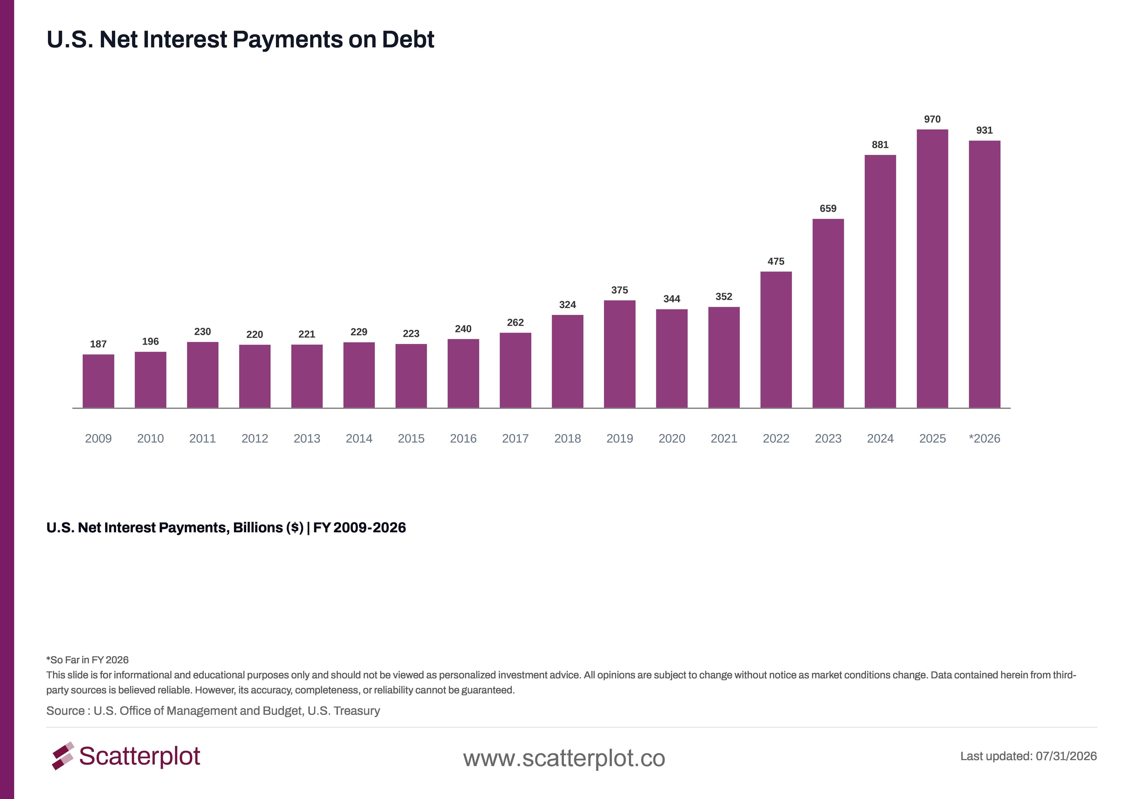
This chart updates daily in the Scatterplot portal.
Where Has the Government Spent Money This Year?
Breaking the fiscal year down by category shows where the money has actually gone, and where it's come from. The chart below shows cumulative receipts and outlays for FY2026 so far.
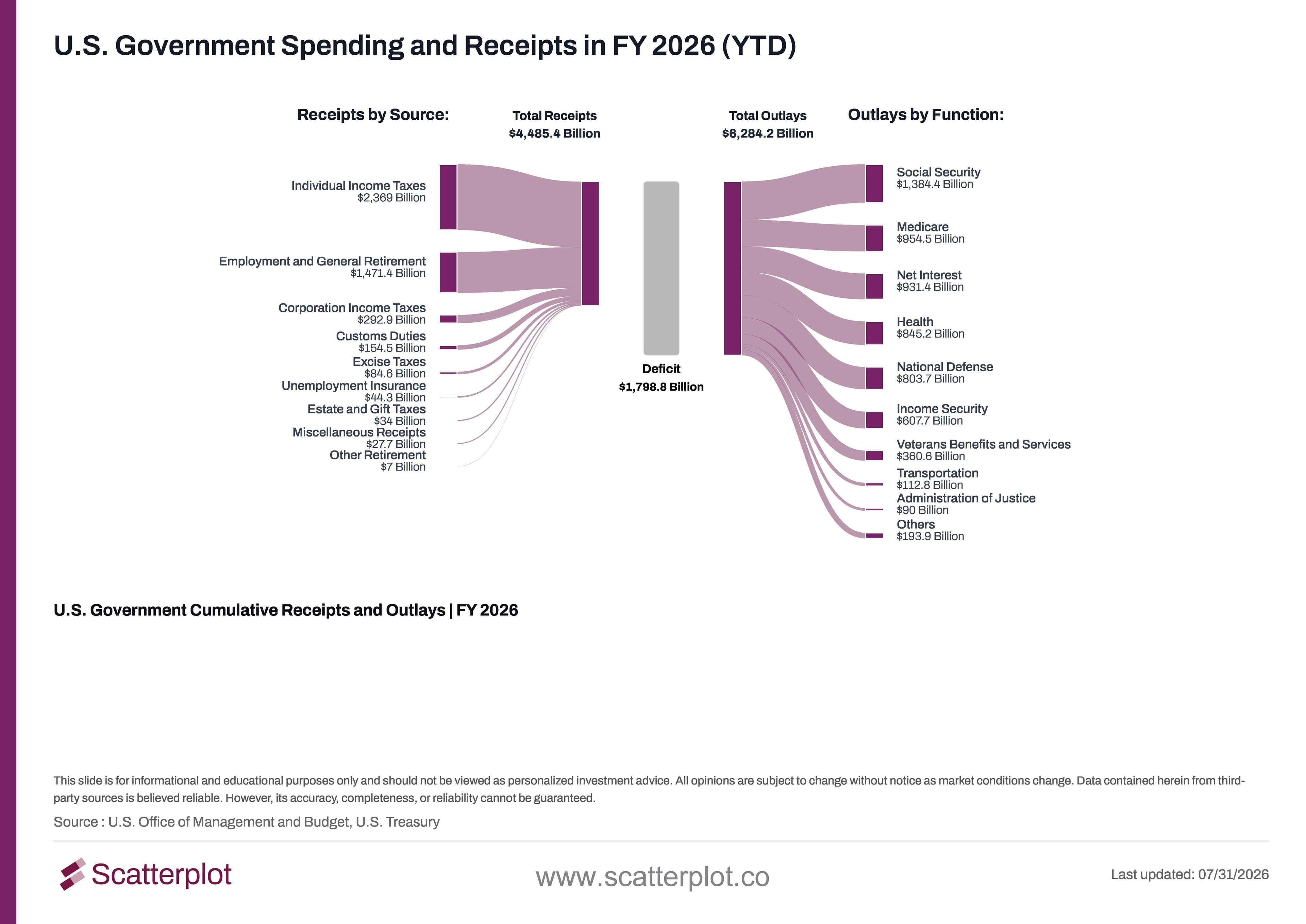
This chart updates daily in the Scatterplot portal.
Disclosure
This content is provided for informational and educational purposes only and should not be relied upon as investment advice. No representation is made that any investment strategy or market view will be successful. Past performance is not indicative of future results. All investing involves risk, including the loss of principal. Please refer to our Terms and Conditions for more information.


Enjoyed this? Get more in your inbox.
Weekly insights for advisors
— charts, research, and practical tools. No fluff.
Market Insights
Why $100 Oil Hurts the U.S. Economy Less Than It Used To
Brent crude has traded above $100 a barrel repeatedly this year. That still stings. But the U.S. economy is less exposed to high oil prices than it was in the past, for three reasons.
Read moreSanjeev Pati, CFA
September 28, 2026 · 5 min read
Investment Foundations
Fed Rate Hikes Since 1994: What Happened in Each Cycle
Inflation, unemployment and equity returns across seven Fed rate-hike episodes since 1994, each with its start, end and accompanying FOMC statement.
Read moreSeptember 21, 2026 · 10 min read